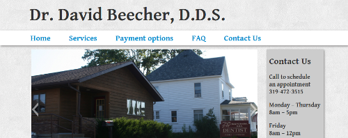
I recently deployed a website for my fathers dental practice. It’s dead simple but I wanted to get some experience with very manually taking a website from zero to deploy, as opposed to opening a Tumblr or a similar solution. The design started with the HTML5 boilerplate and I used the grid system component of Twitter’s bootstrap. I wanted a simple, professional and relaxed design, so I picked some textures off Subtle Patterns, chose the font ‘Gentium Basic‘, and a color palette that I thought portrayed those qualities. It included a nice little slideshow.

I decided to convert the original static design to a WordPress theme. I created a child theme that abandoned everything but some basic WordPress functionality from the parent theme. This step is relatively simple, though CSS tweaking and whatever else can go wrong when you’re interpolating HTML and CSS made it a bit tedious. For hosting I used a local provider Stackd. The project was a nice exploration of CSS grid systems, WordPress architecture and modern web design.